The key principles of web design
Web design is a very important topic which should be carefully executed in order to create a user-friendly and great looking website. There are many tools you can use to create your webdesigns, ranging from free tools like: Figma and paid tools like: AdobeXD. Because web design is such an important topic, we will use this post to explain about the key principles of web design.
By starting your projects with a design, you create a hold on what you want to achieve and for who. This will also make it easier for developers to stick to their goal. Web design is a very extensive subject but there are some key principles you need to take into account when designing a website or any printable item. In this post we will list 7 areas you should consider as key when designing.
While each of these 7 points deserve their own post with how extensive and complex they can get, we will try to keep it as short and straight to the point as possible.
White space
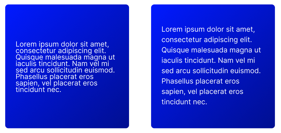
White space, also known as “negative space”, is what we call the empty space around the content and functional elements of a page. The main goal white space has, is to give your elements room to “breathe”. Take the following example where, in the left design we have taken no account for whitespace, whereas in the right design, we have.
While this is a very obvious example, since a bad use of whitespace can be tiring on the eyes. However, it does perfectly highlight the added benefit of taking whitespace into account.
By reducing the amount of cluttered text and elements, the user doesn’t get overloaded by impulses.
Whitespace isn’t just limited to margins and paddings only. It also includes line spacing and letter spacing for text.
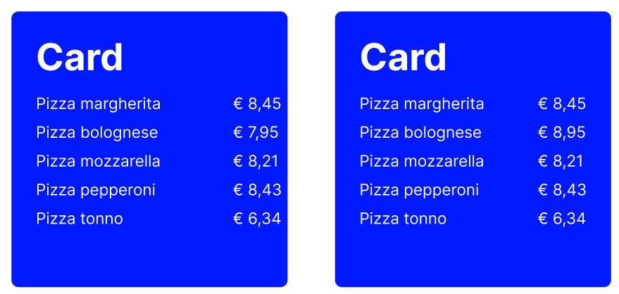
Example: Card whitespace
Take a look at the example below.
In this example, our left image has a more dense line-height as opposed to our right image. In the right image we have increased the line-height of our paragraph. This way we’ve created text that is, more readable and more relaxing on the user’s eyes.
Note: for people using Figma, the line-height set in Figma is not 1 to 1 transferable to CSS. In order to get the CSS line-height, take your Figma line-height and divide this by the Figma font-size!
Contrast
Contrast is the relationship and difference in light between the foreground and background. When using sufficient contrast, your website’s content will be easier to read. This is because the color of the text is strengthened by the contrasting color of, let’s say, the background of the page.
Imagine using a light blue background with a light green card element on top of it with white text. Since you have 2 light colors, they overflow making it more difficult to differentiate between the two. Add some white text to it and you have 3 light colors.
Luckily, there’s a very simple solution for this.
Example: Card contrast
Let’s take the example from above and instead of having a light green card element, let’s make it dark green.
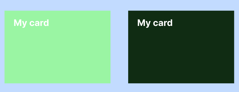
Notice the enormous difference between the two? The left one fails on contrast on two fields, namely:
- The contrast between the light blue background and the light green card
- The contrast between the light green card and the white text
You might say for the example above, that changing the font color to black instead of white will solve the contrast issue. However, this is only partially true. If you see the list above, we solved 2 contrast issues just now. If you’d change the text color to be black, you’d only solve the 2nd item. You would still be left with the contrast issue between the background and the card.
In short, a good use of contrast improves the readability and also the usability of your site.
Note: for people using Figma, there’s a very useful plugin you can use to see if your elements have enough contrast. You can find it here
Color
Colors are a crucial part of your brand, which is why they should be carefully considered when designing your site or printables. To get great colors for your site try to stick to 1-2 colors which you use consistently. This is so that you don’t overload your customers with colors. Next, define your brand. What are you selling or delivering and to who? If you’ve answered those questions you can then find a matching color for your brand.
Example: Watch webshop
Let’s take a look at an easy example
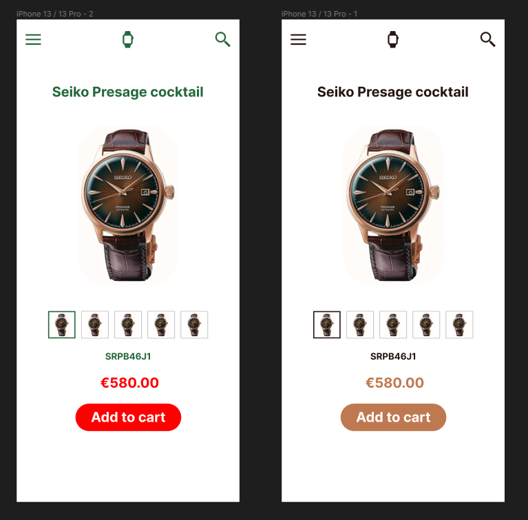
In our left image we have our brand consist of both green and red colors. While the green color might work, it’s often associated with nature and growth. This might not be the best color to use for our watch webshop. The add to cart call-to-action (CTA), which is the element that triggers an actionable response from the user, has been painted red. Since red is a very potent color it’s most often used to warn people. This means, that our action is now warning people and as a result, will get less clicks than you expect.
In our right image we have the same watch webshop but instead used the colors dark brown and beige. Beige is usually associated with cleanliness and welcoming. This means that our CTA is inviting. Our dark brown color is often compared to the earth. This means that we associate this color to resilience, dependability, security and safety. By combining these two colors we now have a calm, clean and dependable look and feel to our watch webshop. These looks also match with the current watch image which gives the site a feeling of symmetry and balance.
Example: McDonald’s
Let’s take the popular restaurant McDonald’s as another example with their red and yellow colors. Red can be seen here as stimulating and being active. Red is also considered to increase someone’s heart rate, which in turn helps to start someone’s appetite. The yellow color is associated with happiness and the most visible color. Our brain processes color before anything else, which is why you can use colors to already bend the customer to your site.
Visual Hierarchy
Visual hierarchy is the order of importance regarding elements which you, as a designer, want to display to your end user. By taking visual hierarchy into account, you can decide what your user should regard as important during their customer journey.
Example: OnlineBlogZone (OBZ)
Taking our own site as an example, we use a large tile to display our most recent post on the homepage. With this we entice users to click on this post and read it. Next, we move on to smaller posts namely, the recent posts we have written. For us those are the next most important thing we need to let users see.
In the right sidebar, we have our popular posts which are quite small. We still want to give users the option to read or most read posts, but we don’t see it as important as our most recent posts.
Example: Twitch.tv
Another example is the popular streaming platform Twitch.tv. Upon opening the site, you’re greeted with a large slider of currently featured streamers. By having this slider as the most prominent part of the site, Twitch is inviting users to look at this part of the site before anything else. Next, we see the channels recommended for our current session, which is probably something you, as a user of Twitch, are looking for. These channels are smaller in size than the slider. Finally, we end with an even smaller list of elements, the categories recommended to you. Because users first want to known if their favorite streamer is live. it has gained more priority in the visual hierarchy as opposed to the category list.
Alignment
Alignment is the positioning of elements on your webpage. To have good alignment, it’s good to keep in mind the following aspects
- There is equal space between and around your elements.
- Your content is not all over the place but instead on places where the end user expects it to be.
Example: Form alignment
If we take a very basic example:
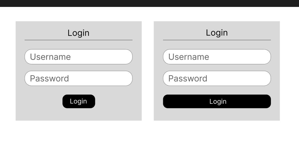
Here, we have a login form with two different types of alignment. The left image has center alignment on the title and button whereas the input fields are left aligned and also full width. A user can feel at unease with the left image since the button can feel out of place here. If we take the right image, we see that the title is still center aligned but the button is full width which makes it immediately seem more as a whole.
Typography
Good typography can strengthen the message you want to pass over to your users. If you have an informative website about a serious topic like climate change but your font family is something like Comic Sans, then the important message you’re trying to pass over will not be taken seriously.
Your site should be readable and aesthetically pleasing for the user.
Scale
Users tend to pay more attention to the bigger elements oppposed to the smaller ones. By using scale you can make specific elements stand out to lesser important elements. However, scale is also a very dangerous topic as you don´t want your site to be filled with elements in different sizes all over the place. By doing that you will only annoy your user and make them leave your site.
Keep in mind that scale is relative to your design’s base size. Let’s say our main font-size is 16px. This means that in terms of scale, this would be your “1”. Now if you were to increase the scale to say 200%, this font-size would be rendered as 32px.
Conclusion
These were our 7 areas we deem important for webdesign. As mentioned before, some of these points may have been fairly straightforward but addressing them never hurts. If you already knew most, if not all, of these points, then you’ve given yourself a fresh reminder as repetition is key to memorization
The next time you’re designing a website, keep these 7 points in mind and you are sure to increase your UI/UX skills
-
- White space
- Contrast
- Color
- Visual Hierarchy
- Alignment
- Typography
- Scale


